-
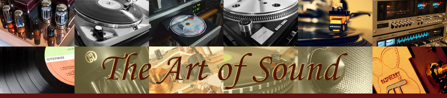
AoS current image logo
I noticed that the logo includes the Apogee DAC, which was recently reviewed alongside the Beresford in HIFI Choice. Given that the Beresford out performed the Apogee in their lab test report, and is a mere fraction of the price, would it be justified to give such prominence to the Apogee?
Of course, my apologies if I got it wrong in my thinking. I am already surprised that the highly respected 1200 is not part of the logo.
Stan
-
Ah... funny you should say that, 'watch this space', as they say! ;)
-
Yep, there will be a few adjustments made to the banner soon, Stan :)
Marco.
-
You are free to take some images from www.SL-1200-MK2.com
Dave
-
That might be an idea, Dave. The management team will be reviewing the contents of the logo in due course :)
Marco.
-
Indeed Stan, as soon as your new DAC is ready and I've bought one, it'll be going on the banner. :)
-
If its OK I'd like to make a critcal comment on the banner design as its actually something that I'm qualified to comment on:)
Cover the pictures only and ask yourself in what direction does your eye flow over the writing.
Then cover the writing only and ask yourself in what direction your eye flow over the montage.
They should flow in the same direction.:)
-
Interesting comment, Paul. We'll see what Rob thinks - that's his playground :)
Marco.
-
Should the pictures be viewed in a particular way then? I assume you mean that the eye naturally follows the pictures in a circular motion (or rectangular) and the writing from left to right. Yes, that is a difference but how many people would cover the images and the text rather than just viewing it as a whole?
Remember that it's not like a road sign that has to be read quickly and efficiently, it's simply a decoration showing some member's components, we'll assume that people who are already here don't need to know that this is 'The Art of Sound' as they must have already typed it or read it at least once to get here in the first place. I think you may be taking it for more than it is, and it was a design that was chosen amongst several people out of several designs as to be most suitable and decorative for the site.
What alterations would you make?
-
Hi Rob, please don't take it personal.
Put it this way, if it was me I would re arrange the pics so that the eye flows from top left to bottom right. This might be achieved by puting the lighter images in the top left and gradually going darker with the darkest in the bottom right while also keeping a general trend of having the images at the top lighter than the ones at the bottom.
However its not me and uptake is optional I just thought I would make the suggestion while also not trying to upset anyone.